 Indra Kusuma
The annual ritual of selecting a "Color of the Year" has long served as a bellwether for the interior design industry, reflecting the intersection of cultural moods, aesthetic evolution, and consumer demand. As the design world looks toward the latter half of the decade, Benjamin Moore has officially designated Webster Green (HC-130) as its flagship hue for 2027. Moving away from the high-octane or trend-chasing shades that have characterized recent years, this selection represents a strategic pivot toward longevity, grounding, and historical continuity.
Webster Green is a nuanced, mid-tone green characterized by a subtle gray undertone. This muted quality allows the color to oscillate between a dramatic, saturated statement and a quiet, neutral backdrop. By choosing a shade that feels both classic and contemporary, Benjamin Moore is signaling a shift in the residential design market: a move toward "staying power" in an era of rapid digital turnover and fleeting micro-trends.
The Evolution of the Color Forecasting Cycle
To understand the weight of Benjamin Moore’s decision, one must look at the historical trajectory of color forecasting. For the better part of the last decade, paint manufacturers have utilized the Color of the Year announcement as a marketing lever to influence home improvement projects and commercial architecture. In the early 2020s, the industry leaned heavily into biophilic design, prioritizing greens and earth tones as a response to the isolation of the global pandemic.
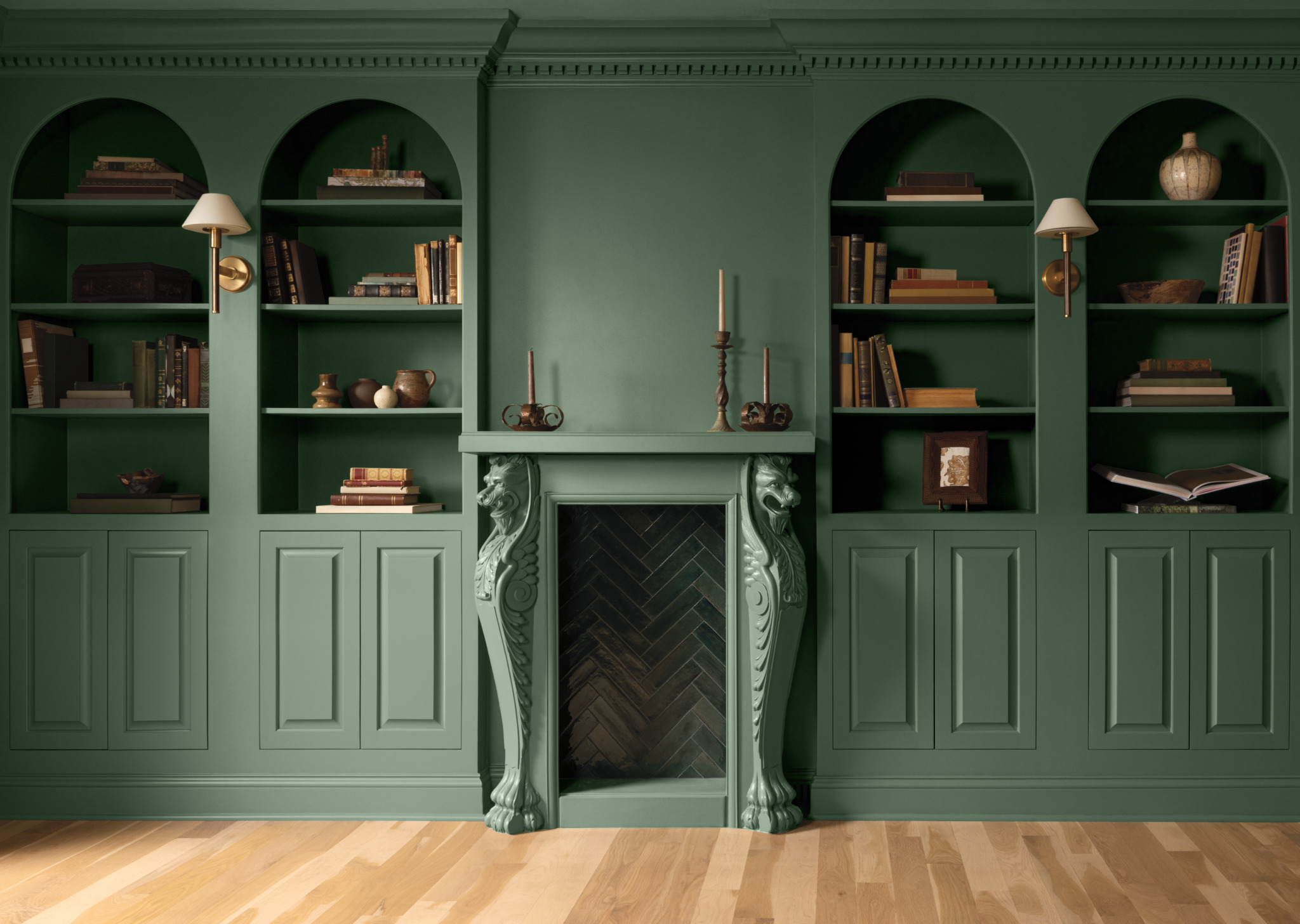
However, 2027 marks a departure from the "reactive" color palettes of the past. Andrea Magno, the Vice President of Brand, Color, and Integrated Marketing at Benjamin Moore, notes that the research process for the 2027 collection required a broader look at the past, present, and future of architectural design. "When we looked across the past, present, and future of color trends, variations on green consistently demonstrated remarkable staying power," Magno stated.
This decision follows a three-year cycle of observation where Benjamin Moore’s color team tracked consumer preferences in both residential renovations and high-end commercial hospitality spaces. The result is a color that does not demand attention but rather commands it through its inherent versatility.
The Anatomy of Webster Green: A Design Analysis
Webster Green (HC-130) is not a new invention for the brand; rather, its selection as the definitive color of 2027 highlights its status as a foundational element within Benjamin Moore’s Historical Collection. The color’s composition—a precise balance of verdant pigment and gray-scale muting—allows it to adapt to diverse lighting conditions.
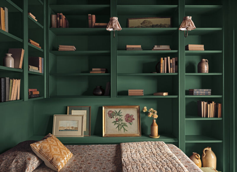
In practice, this creates significant implications for interior designers and homeowners. In rooms with high natural light, the green emerges with clarity and freshness, making it an ideal candidate for kitchens or sunrooms. Conversely, in low-light environments, such as libraries, studies, or bedrooms, the gray undertones take center stage, creating an enveloping, moody atmosphere that feels sophisticated rather than cold.
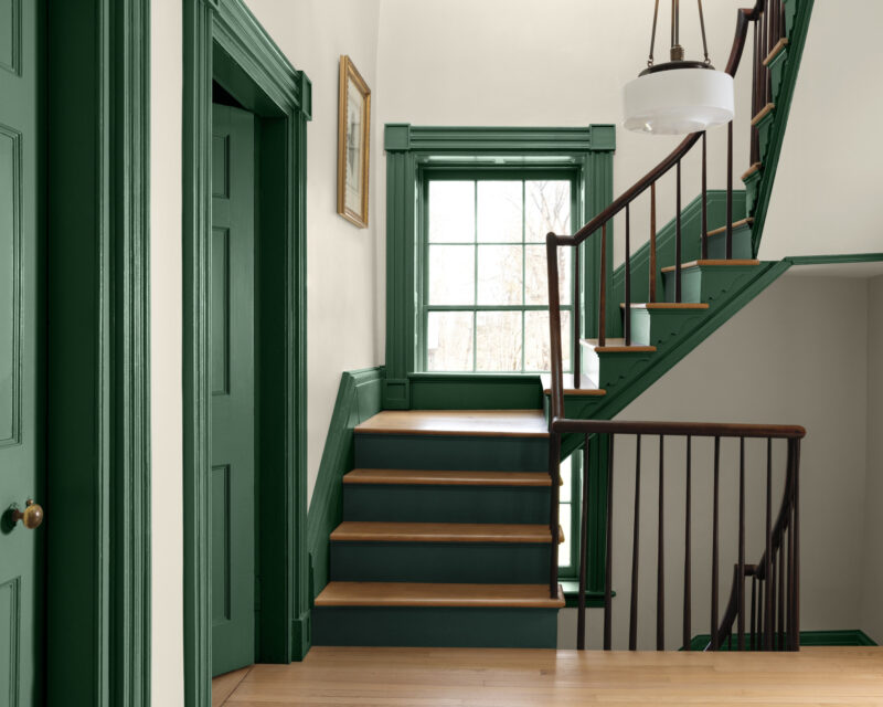
From an architectural standpoint, the color functions as an "anchor." It provides enough depth to define large, open-concept spaces while remaining restrained enough to serve as a bridge between disparate materials, such as raw wood, brushed metals, and natural stone. The ability to work across both traditional architecture—characterized by ornate moldings and fireplaces—and minimalist modern construction is the hallmark of the 2027 selection.
The 2027 Color Trends Palette: Context and Composition
Webster Green does not exist in a vacuum; it anchors a carefully curated palette of eight colors, all drawn from the brand’s extensive library of over 3,500 options. This collection is intended to provide a cohesive visual language for interior design projects throughout the coming year.
The accompanying palette includes:
- White Down (OC-131): A foundational, soft off-white designed to balance the richness of the primary green.
- Nelson Blue (CW-635): A pale, watery blue that adds a cooling element to the palette.
- Shakespeare Tan (228): A golden neutral that introduces warmth and organic texture.
- Wild Aster (1240): A muted pink with gray undertones, offering a subtle, sophisticated contrast to the green.
- Antique Copper (1169): A reddish-brown hue that brings a metallic-adjacent warmth.
- Durango (2137-30): A dark neutral with olive undertones, adding depth and shadow.
- Townsend Harbor Brown (HC-64): A rich, burgundy-leaning brown that provides a grounding, dramatic finish.
This collection demonstrates a move away from the high-contrast color-blocking that dominated interior trends in 2024 and 2025. Instead, the 2027 palette favors harmony and tonal layering, allowing designers to create spaces that feel "collected" over time rather than styled in a single afternoon.
Industry Implications and Market Impact
The decision by a major market leader like Benjamin Moore to select a "classic" shade has broader implications for the home decor and real estate markets. Historically, paint trends often trickle down into furniture manufacturing, textile design, and even residential staging.
Real estate analysts have observed that neutral, yet distinctive, paint choices can have a tangible impact on property value and buyer perception. By selecting a color that bridges the gap between historical character and modern minimalism, Benjamin Moore is effectively providing a "safe" yet stylish choice for homeowners looking to modernize their properties without alienating traditional buyers.
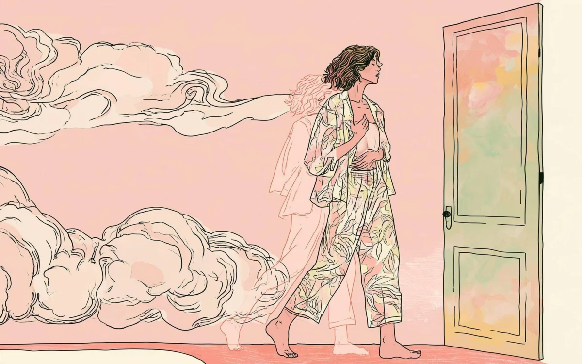
Furthermore, the collaboration with illustrator Tanu Vasu to document the palette’s inspiration suggests a concerted effort to connect the brand with the broader art and creative community. By framing the 2027 palette within the context of hand-drawn exploration, the brand is elevating the act of painting from a maintenance chore to a form of personal expression and historical preservation.
Looking Toward the Future of Interior Aesthetics
As we move toward 2027, the emphasis on "permanence" in design is becoming increasingly relevant. Global supply chain disruptions and environmental concerns have shifted consumer behavior toward products that are durable and aesthetically timeless. Webster Green is the direct manifestation of this "slow design" movement.
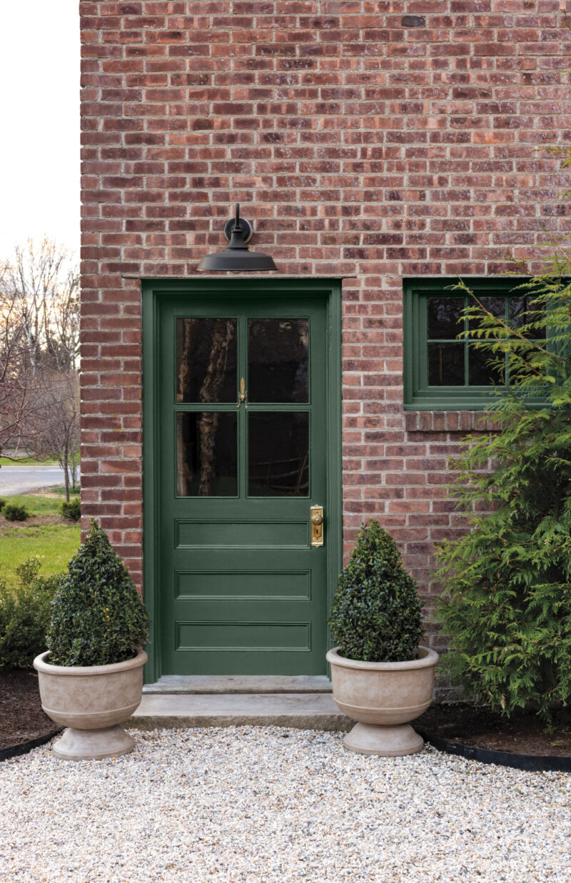
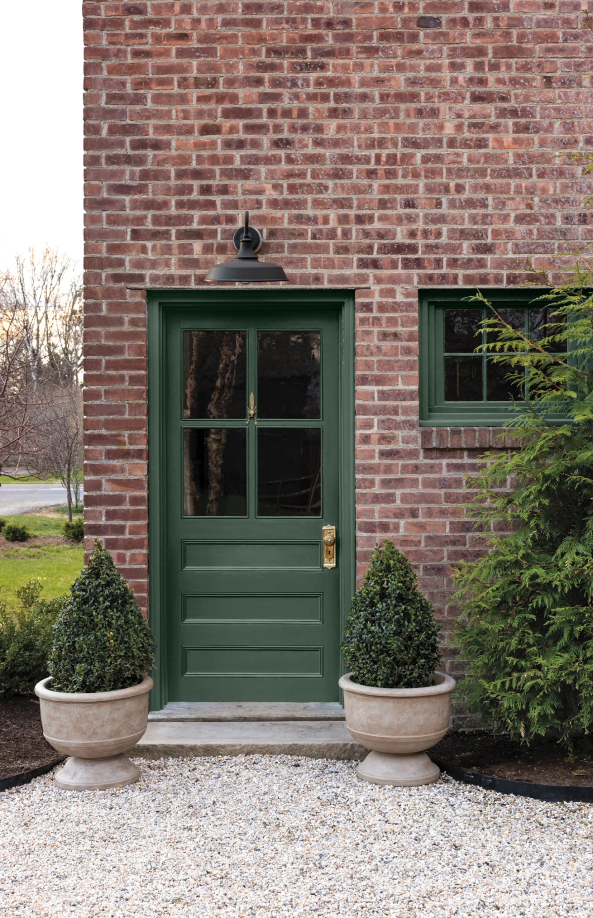
The color’s ability to transition from an exterior front door—as seen in its application on traditional brick facades—to the interior of a floor-to-ceiling library bookshelf demonstrates a level of utility that is rare in contemporary color forecasting. It is a testament to the fact that, in an increasingly digital and ephemeral world, there is a renewed human desire for spaces that feel "rooted."
Benjamin Moore’s strategy for 2027 is clear: provide the consumer with a tool that removes the anxiety of trend-chasing. By selecting a color that has already proven its worth in the brand’s historical archives, they are telling the consumer that the best path forward is to look backward at what has remained beautiful.
In conclusion, the selection of Webster Green reflects a maturing market. Whether it is being used to update a mid-century living room or to add character to a new-build apartment, the 2027 Color of the Year serves as a reminder that color is not merely a decorative choice, but an essential component of how we experience our homes. With its balance of familiarity and potential, Webster Green is poised to become a staple of residential design for years to come, proving that the most relevant color is often one that has the strength to endure.