 Indra Kusuma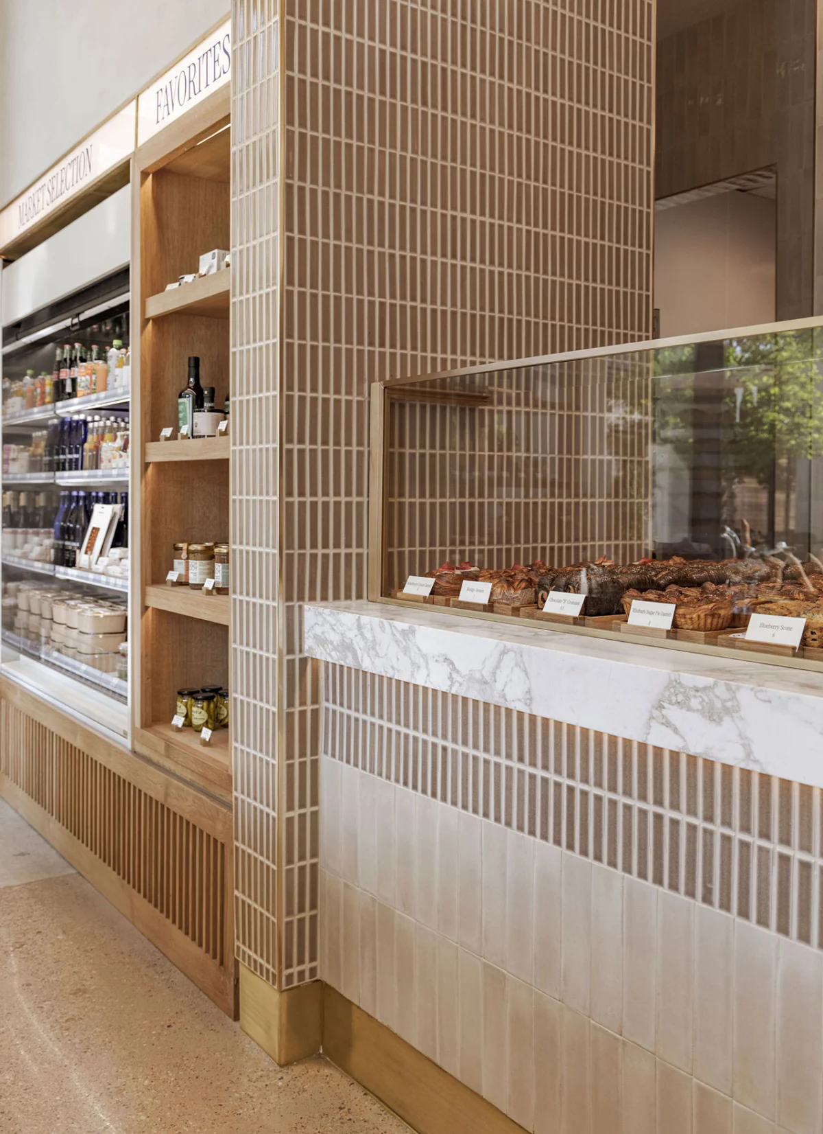
Dallas, Texas – The cherished ritual of acquiring a fresh baguette from a Parisian boulangerie, a sensory delight and a highlight for culinary travelers, often finds few true counterparts in the United States. Many American grab-and-go bakeries, while attempting to emulate the aesthetic of a classic French café, frequently fall short of capturing the authentic essence and distinct character that makes their European inspirations so beloved. However, a new establishment in Dallas, The Bread Club, is challenging this norm, offering a meticulously crafted experience that marries traditional French bakery elements with a sophisticated, contemporary design sensibility, conceptualized by the innovative minds at INK+ORO Creatives. This 1,120-square-foot eatery is not merely a place to purchase bread; it is an architectural and culinary statement, aiming to redefine the American bakery landscape.

A Vision Born from Parisian Inspiration
The genesis of The Bread Club was rooted in a profound appreciation for the daily ritual of visiting a Parisian market to select fresh loaves. This foundational inspiration guided INK+ORO Creatives, a design studio renowned for its thoughtful and context-aware projects, in shaping a space that evokes the spirit of Paris without resorting to clichéd imitations. Tiffany Woodson, founder and CEO of INK+ORO Creatives, articulated the core design philosophy: "The biggest challenge was reminding ourselves that we couldn’t turn the space into a French boulangerie. We kept coming back to strong architectural basics, trusting that restraint would do more to enhance the concept and showcase the product more than any decorative flourish could." This approach underscores a commitment to authenticity and a belief that true sophistication lies in understated elegance and functional design. The objective was to create an environment that feels inherently European in its quality and attention to detail, yet distinctly American in its modern execution and welcoming atmosphere.

The project began with a clear understanding of the client’s desire to transport customers to a familiar, comforting European setting, while simultaneously catering to the contemporary preferences of the Dallas clientele. This dual mandate required a delicate balance, ensuring that the design elements were not merely decorative but served a purpose in enhancing the customer journey and product presentation. The initial conceptualization phase involved extensive research into traditional French bakery layouts, material palettes, and the subtle cues that evoke a sense of heritage and artisanal craftsmanship. However, the designers consciously filtered these influences through a modern lens, prioritizing clean lines, functional simplicity, and an overarching sense of calm and clarity.
Dallas’s Evolving Culinary and Design Landscape

Dallas has emerged as a significant hub for culinary innovation and sophisticated design in recent years. The city’s rapid growth and diverse population have fostered a vibrant food scene, with consumers increasingly seeking elevated experiences and high-quality, artisanal products. This evolving market provided fertile ground for a concept like The Bread Club, which offers a distinctive alternative to conventional grab-and-go establishments. According to recent market analyses, the specialty bakery segment in the United States has seen consistent growth, driven by consumer demand for healthier options, gourmet products, and unique culinary experiences. Reports indicate a growing preference for bakeries that emphasize fresh, locally sourced ingredients and traditional baking methods, aligning perfectly with The Bread Club’s ethos.
INK+ORO Creatives, with its portfolio of high-profile commercial and residential projects, was ideally positioned to translate this vision into a tangible space. The studio’s expertise in creating environments that are both aesthetically pleasing and highly functional was crucial for a commercial venture where operational efficiency is as important as customer appeal. Their design philosophy often centers on creating timeless spaces that reflect the client’s brand identity while providing a comfortable and engaging experience for patrons. For The Bread Club, this meant crafting an interior that speaks to quality and craftsmanship, echoing the products it sells.

Architectural Restraint and Sensory Engagement
The interior architecture of The Bread Club is a testament to the power of thoughtful design. The 1,120-square-foot space is expertly utilized to create a sense of expansiveness and flow. A defining feature is the curved plaster ceiling, which not only adds significant volume and visual interest but also serves a practical purpose. This architectural element subtly guides customers, delineating the queuing area and drawing attention to the main point of interaction: the service counter. The gentle curve also contributes to a softer acoustic environment, enhancing the overall tranquility of the space.

Lighting plays a crucial role in product presentation. Delicate light boxes are strategically integrated to illuminate the fresh goods, highlighting their textures and colors in an inviting manner. This focused illumination ensures that each pastry and loaf is presented at its best, enticing customers with visual appeal. The shelving system, designed for accessibility, caters to both front-of-house staff and bakers working in the rear, facilitating efficient restocking and maintaining a continuous display of fresh items. A distinctive vertical display unit, custom-built, proudly showcases the bakery’s signature baguettes, emphasizing their artisanal quality. Complementing these displays are matching cases dedicated to cold beverages and other provisions, ensuring a comprehensive offering within a cohesive design language.
Tiffany Woodson further elaborated on the intentionality behind the design choices: "Every element, from the ceiling’s curve to the placement of each light, was considered for its ability to enhance the customer’s interaction with our products and the space itself. We wanted the environment to feel sophisticated, but never intimidating, always warm and inviting." This commitment to a holistic sensory experience is evident throughout the bakery.

A Harmonious Palette and Tactile Textures
The material and color palette of The Bread Club is a masterclass in understated elegance. The overall scheme is neutral, creating a serene and adaptable backdrop. However, this neutrality is imbued with just enough warmth to evoke a welcoming and cozy ambiance, preventing the space from feeling stark or clinical. This deliberate choice ensures that the interior remains relevant and appealing, even as menu items or seasonal offerings evolve. A subtle hint of color is introduced through the blue lettering on the signage, providing a refined visual accent that complements the muted tones.

The selection of materials further elevates the sensory experience. Luxe touches are incorporated to evoke a softness reminiscent of freshly baked bread. Tiles with a subtle crackle finish adorn various surfaces, adding a touch of artisanal charm and texture. These tiles are meticulously paired with custom millwork, showcasing the craftsmanship and attention to detail inherent in the design. Perhaps most notably, the walls feature the same plaster treatment used for the curved ceiling, creating a consistent and enveloping "buttery texture" throughout the space. This tactile quality, combined with the gentle lighting, contributes to an atmosphere that is both visually appealing and physically comforting.
The careful selection of materials and finishes extends to every corner of the bakery, including the customer areas and even the restrooms, which maintain the sophisticated, understated aesthetic with marble-topped vanities and elegant tiling. The seating areas, bathed in natural light from large windows, feature light wood tables and chairs, often adorned with simple vases of white flowers, enhancing the fresh and clean aesthetic. Outdoor seating options, complete with striped awnings and planters, further extend the welcoming environment, inviting patrons to linger and enjoy their purchases in the fresh air. A charming bicycle, often parked outside with baskets overflowing with baguettes, serves as a whimsical and iconic visual, reinforcing the Parisian market inspiration.

Implications and Future Outlook
The Bread Club represents more than just a new bakery; it signifies a thoughtful evolution in retail design and the culinary experience. By consciously moving away from literal imitation and embracing a philosophy of sophisticated restraint, INK+ORO Creatives has crafted a space that is both deeply referential and refreshingly original. This approach offers a compelling model for businesses seeking to honor traditional inspirations while catering to modern sensibilities.

The "subtle nod to Texas wheat woven into the design’s sensibility" is particularly noteworthy. As Tiffany Woodson observes, "It’s never literal. It gives the space a timeless, unpretentious quality that feels welcoming to everyone." This integration of local identity without overt symbolism speaks to a nuanced understanding of place and product. It allows The Bread Club to resonate with its Dallas community while maintaining its connection to a global culinary heritage. This design choice implies a belief that true regional character can be expressed through texture, form, and light, rather than overt iconography.
The success of The Bread Club could have broader implications for the bakery and café industry. It demonstrates that consumers are increasingly valuing authentic experiences and well-designed spaces that prioritize comfort, quality, and a sense of place. This shift encourages other establishments to invest in thoughtful design that elevates the overall customer journey, moving beyond mere transactional exchanges to create memorable interactions. The emphasis on high-quality ingredients, traditional techniques, and an inviting atmosphere suggests a growing market for artisanal craftsmanship and bespoke experiences.

Furthermore, The Bread Club’s design highlights the importance of collaboration between visionary clients and talented design studios. The synergy between the bakery’s owners, who envisioned a refined yet welcoming space, and INK+ORO Creatives, who translated that vision into a meticulously executed reality, underscores how strategic design can become a powerful differentiator in a competitive market. The bakery is not just selling bread and pastries; it is selling an experience – one of European charm, contemporary elegance, and a quiet sense of belonging.
As The Bread Club continues to serve the Dallas community, its design will undoubtedly contribute to its long-term appeal. The timeless quality of its architecture and interior design ensures that it will remain relevant and aesthetically pleasing for years to come, avoiding the pitfalls of fleeting trends. It stands as a testament to the idea that a contemporary bakery can indeed capture the essence of a Parisian market, delivering a feast for the senses, even far from the City of Light.

For those interested in the innovative design solutions implemented at The Bread Club and other projects by the studio, further details can be found at inkandoro.com. The striking visual narrative of the space is beautifully captured by photographer Aaron Dougherty, whose work brings the thoughtful details of the design to life.