 Cintya Tara Annisa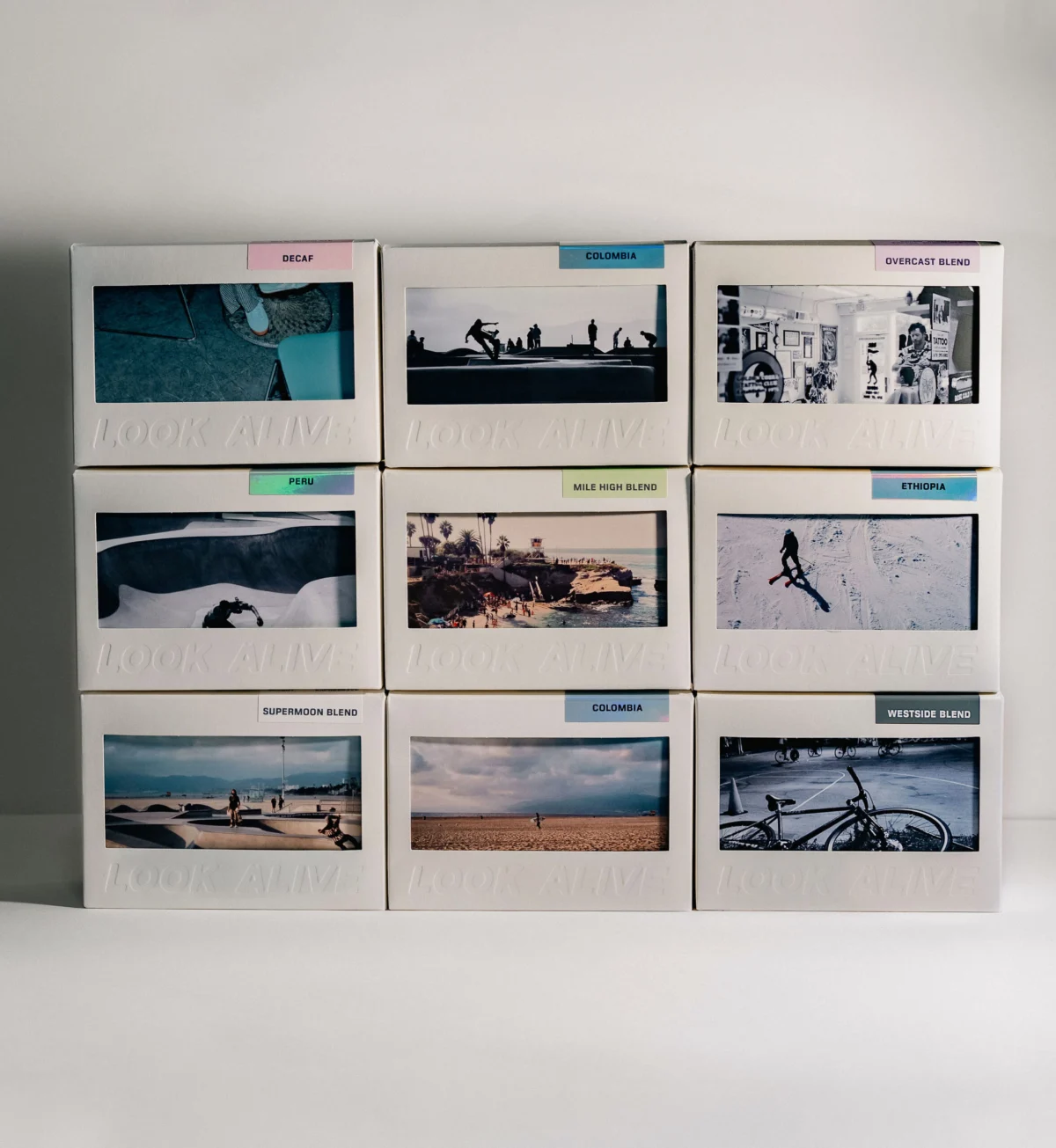
The intersection of specialty coffee and visual art has reached a new milestone as Look Alive Coffee introduces a revolutionary packaging design for its limited-edition product line. By integrating a functional, mailable postcard into the structure of the coffee box, the company is bridging the gap between tactile communication and high-end commodity consumption. This development represents a significant departure from standard industry practices, where packaging often serves a purely utilitarian or aesthetic purpose, by transforming the container into an interactive, shareable medium.
The Evolution of Coffee Branding and Packaging
In the contemporary specialty coffee market, the "unboxing experience" has become a critical touchpoint for consumer engagement. Data from recent market research indicates that over 60% of specialty coffee consumers report that packaging design significantly influences their perception of a brand’s quality and value. Historically, coffee bags were designed primarily for shelf stability and freshness, utilizing barrier films to prevent oxidation. However, the rise of "Third Wave" coffee culture has shifted the industry focus toward storytelling, provenance, and the elevation of the coffee-drinking ritual.
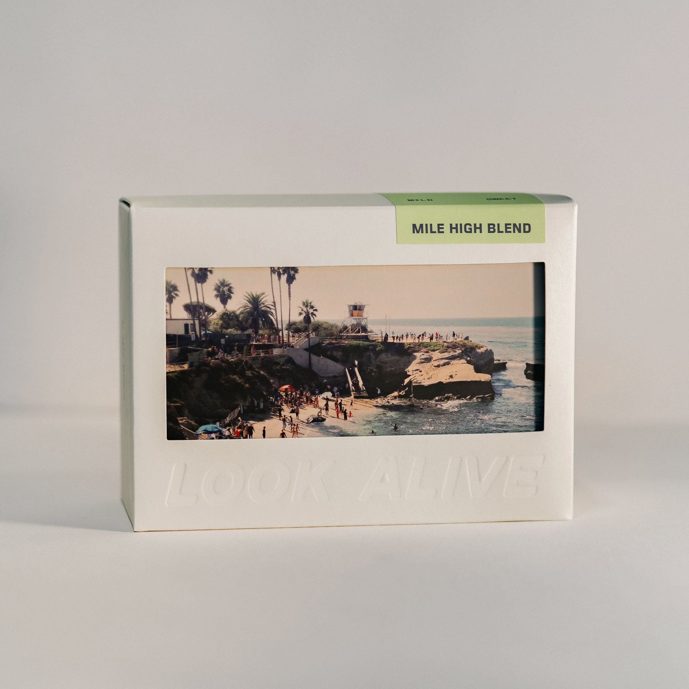
Look Alive Coffee’s decision to move beyond the traditional bag format reflects a broader industry trend toward personalization and artistic collaboration. By utilizing an in-house design approach, the company has managed to maintain a cohesive brand identity while allowing for the fluid, modular incorporation of diverse artistic works. This move away from mass-produced, standardized labels toward limited-edition, artist-led packaging mimics the scarcity-driven models found in the fine art and high-fashion sectors.
A Seven-Month Chronology of Development
The transition to this new, art-centric packaging was not a sudden pivot but the result of a deliberate, seven-month development cycle. According to internal project documentation, the process began with a foundational requirement: to create a package that felt less like a container and more like a discovery.
- Months 1-2: Concept and Structural Engineering: The initial phase focused on the structural integrity of the box. Designers worked to ensure that the internal components would safely house the coffee beans while providing a seamless, durable surface for the integrated postcard feature.
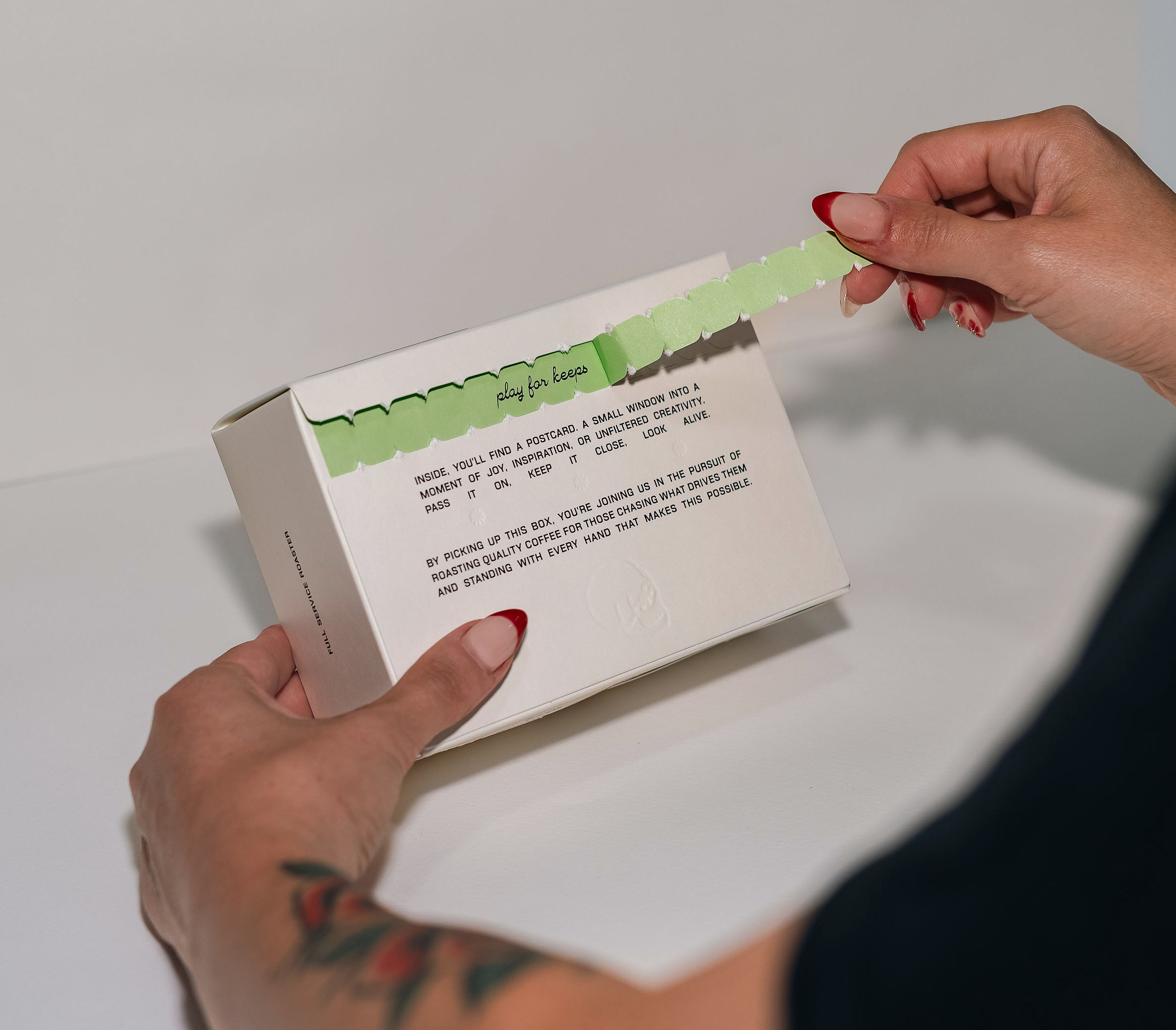
- Months 3-5: Iterative Prototyping: During this period, the design team experimented with various paper stocks, finishes, and tear-strip mechanisms. The goal was to ensure the "unboxing" moment felt premium and tactile. The "Play For Keeps" tagline, revealed upon opening the box, was finalized during this stage to reinforce the brand’s commitment to intentional living.
- Months 6-7: Artistic Curation and Final Production: The final phase involved sourcing photography and ensuring that the printing process met high-fidelity standards. The team established a protocol for rotating the featured artwork, ensuring that each limited release could be treated as a distinct collector’s item.
Design Philosophy and In-House Execution
Kelly Packard, co-owner and lead designer at Look Alive Coffee, spearheaded the project. By opting to keep the design process entirely in-house, the company avoided the typical "design by committee" constraints often found when outsourcing to external agencies. This autonomy allowed for a more agile response to creative feedback and ensured the packaging remained deeply tethered to the brand’s core values: curiosity, self-expression, and a DIY-inspired approach to business.
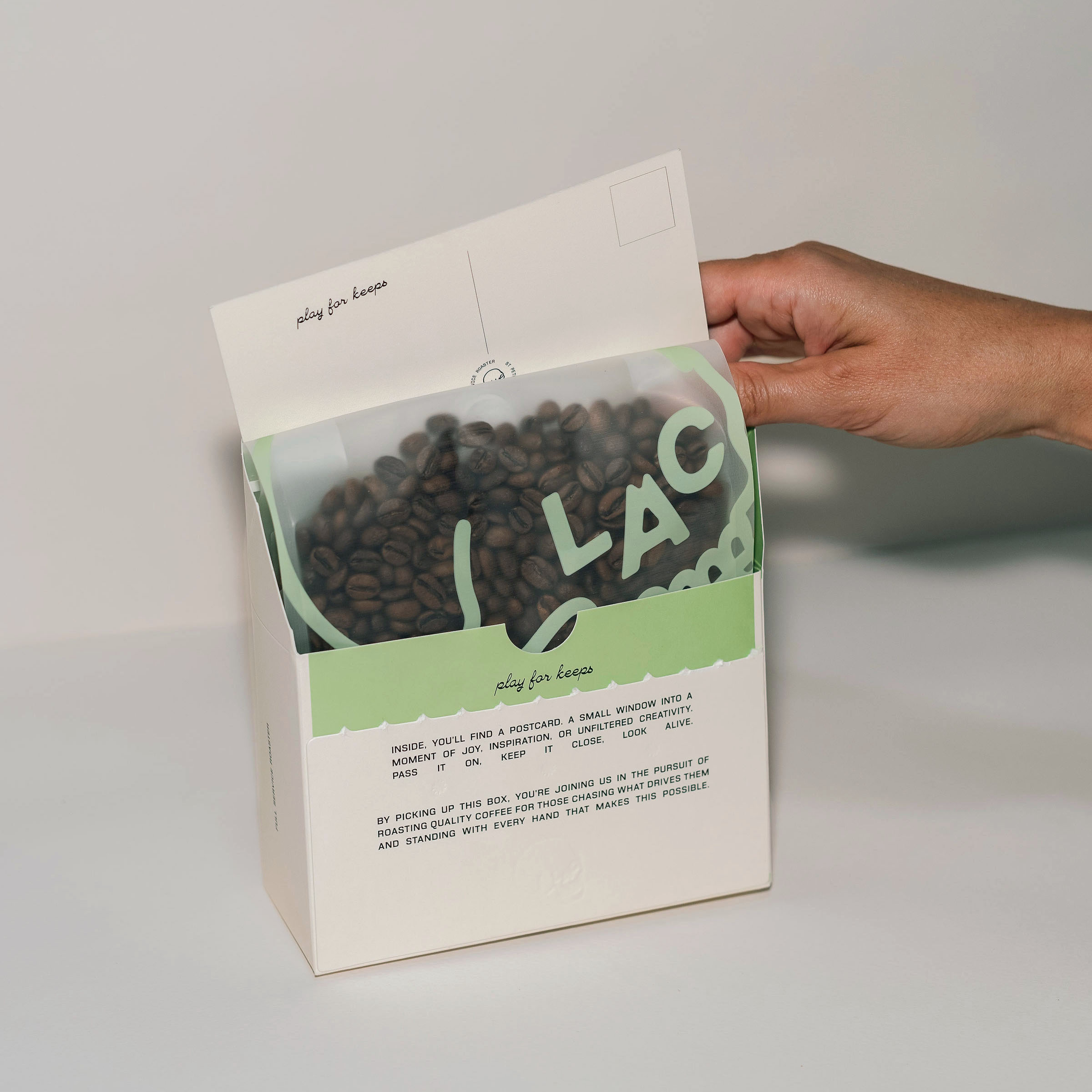
The packaging serves as a tangible expression of the brand’s ethos. In an era dominated by digital interaction, the inclusion of a physical, mail-ready postcard is a deliberate subversion of current communication trends. It invites the consumer to perform an analog act—writing a note and sending it through the mail—thereby extending the life of the brand experience long after the coffee has been consumed.
Technical Specifications and Sustainability
Beyond its aesthetic utility, the design adheres to contemporary environmental standards. The outer box is constructed from fully recyclable materials, addressing the growing consumer demand for sustainable packaging in the coffee industry. In recent years, the industry has faced pressure to reduce its reliance on multi-layer, non-recyclable soft plastics. While many companies have transitioned to compostable pouches, Look Alive Coffee’s rigid box design offers a different approach to material efficiency, focusing on recyclability and the repurposing of components.
The labels on each box provide a comprehensive breakdown of technical data, including the producer, origin, processing method, roast profile, and flavor notes. By pairing this objective information with the subjective experience of the artwork, the brand creates a dual-layered educational experience for the consumer.
Broader Implications for the Specialty Coffee Industry
The introduction of this packaging format signals a maturation of the specialty coffee sector, where the "coffee as a commodity" model is being aggressively replaced by "coffee as a lifestyle product." Analysts suggest that such innovations are essential for brands operating in crowded markets where differentiation is difficult to achieve on flavor profiles alone.
By turning a shipping box into a canvas, Look Alive Coffee is effectively building a community of brand advocates. The implication for the broader industry is clear: the future of coffee packaging lies in interactivity. When a consumer receives a product that encourages them to participate in an act of kindness or social connection—such as sending a postcard—the brand value is significantly amplified.
Official Stance and Market Availability
Look Alive Coffee has emphasized that the flexibility of this new design allows them to adapt to future collaborations, including potential hand-screen-printed editions or limited-run artistic features. This scalability ensures that the brand can continue to evolve its aesthetic without needing to overhaul its structural foundations.
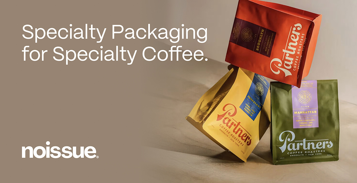
The 250g boxes are currently available through the company’s official online portal and select wholesale partners, including specialized cafes and retail boutiques. The partnership with the packaging design platform noissue underscores a collaborative effort to bring these high-quality, sustainably conscious solutions to market.
As the specialty coffee industry moves further into the mid-2020s, the focus on the "total experience" of the consumer—from the provenance of the bean to the design of the box—will likely become the standard. Look Alive Coffee’s latest initiative sets a high bar, demonstrating that with enough intentionality, even the most mundane object can be transformed into a piece of art that fosters connection, discovery, and, ultimately, a more meaningful interaction with the daily ritual of coffee consumption.
By prioritizing the creative process and investing in the tactile nature of their packaging, the company is not merely selling coffee; they are providing a platform for artists and a medium for their customers to express themselves. The "Play For Keeps" philosophy, now embedded in the physical design of their packaging, serves as a rallying cry for a consumer base that increasingly values substance, creativity, and the preservation of the tangible in an increasingly digital world. This strategic shift serves as a case study for small-to-medium enterprises looking to leverage design as a primary competitive advantage. As future limited releases roll out, the market will undoubtedly watch to see how this flexible, art-forward approach influences the next generation of specialty coffee branding.