 Indra Kusuma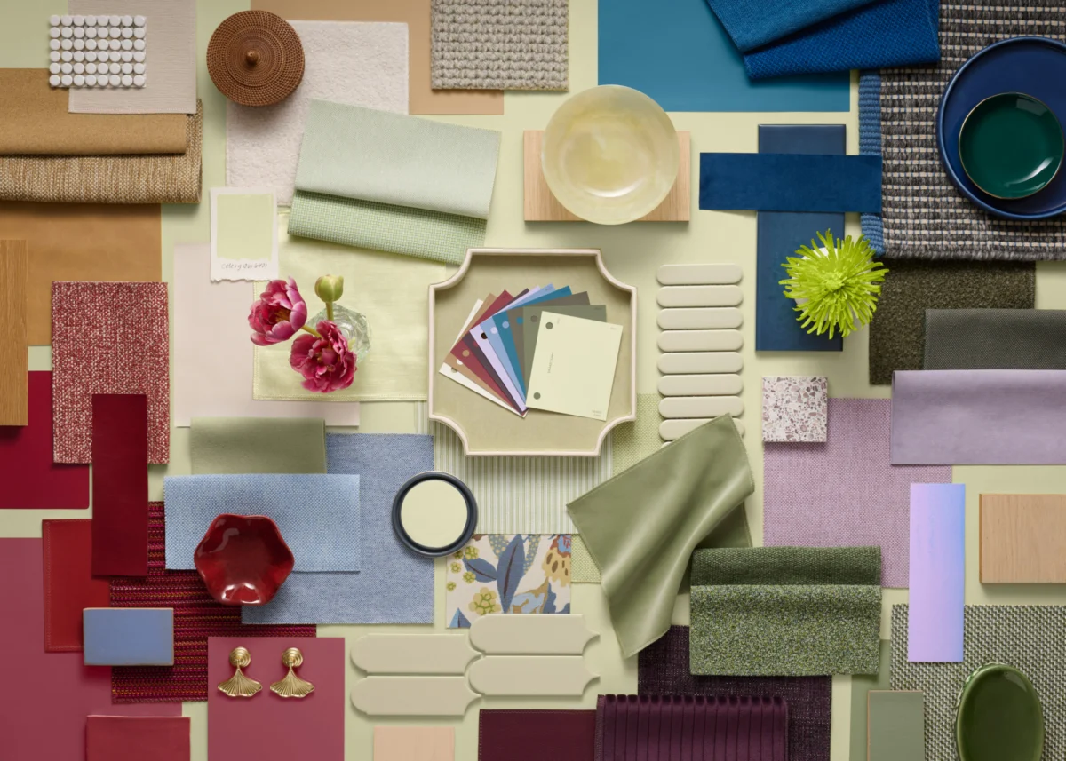
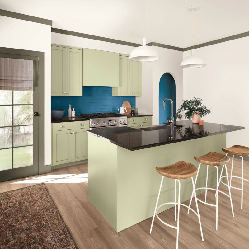
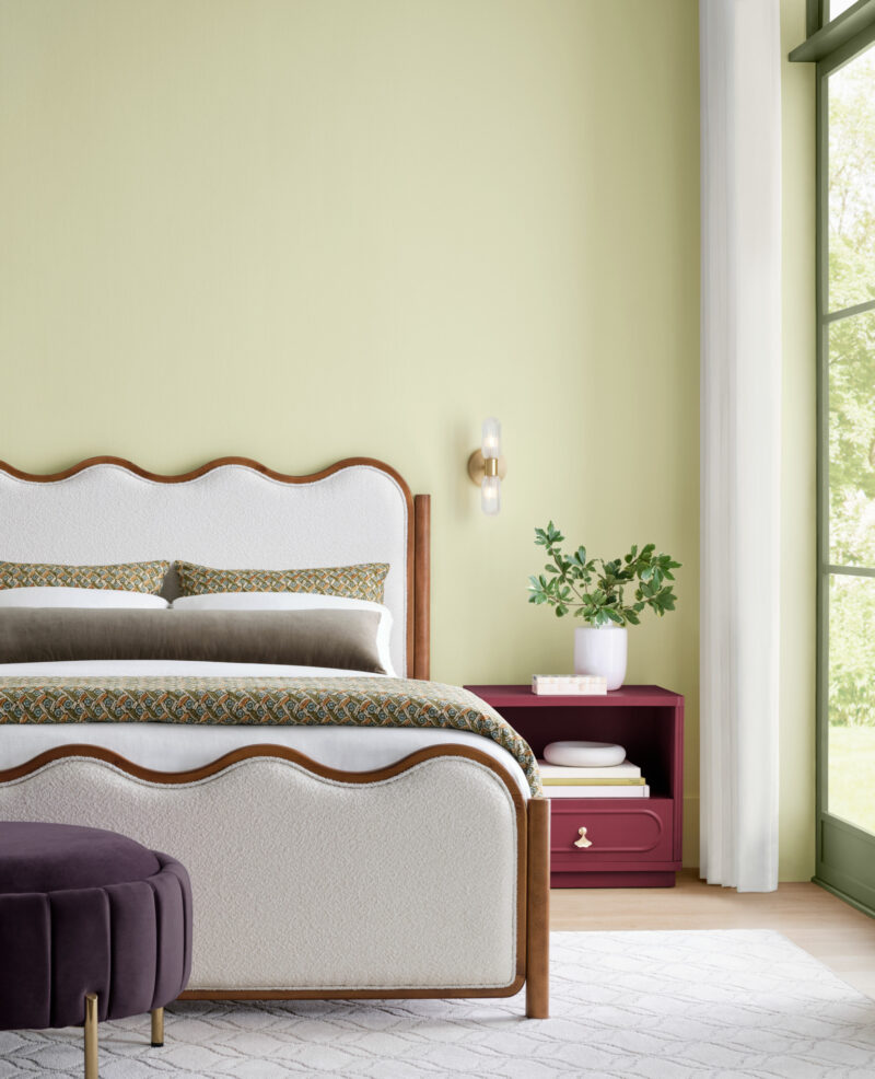
The interior design landscape is undergoing a notable transition as Sherwin-Williams, a global leader in the paint and coatings industry, has officially unveiled its 2027 Color of the Year: Celery (SW 6421). This selection represents a departure from the high-contrast, moody, and deeply saturated greens that have characterized home aesthetics over the past several years. Instead, Celery introduces a softer, herbal green profile with subtle yellow undertones, designed to evoke a sense of lightness and natural tranquility. The announcement, made in collaboration with the HGTV Home by Sherwin-Williams brand, reflects an evolving consumer desire for domestic spaces that prioritize mental health, balance, and a “lived-in” aesthetic over rigid, highly stylized environments.
The Evolution of Color Trends: A Chronological Context
To understand the significance of the 2027 selection, one must examine the trajectory of color trends over the last decade. Following the mid-2010s preference for "millennial pink" and various shades of industrial grey, the market shifted toward "biophilic design" during the pandemic era. This movement favored deep, forest-inspired greens and dark, grounding earth tones intended to bring the outdoors inside during periods of social isolation.
By 2025 and 2026, the industry began to experience a "green fatigue" regarding darker shades. While green remained the dominant color family, designers began pivoting toward lighter, more luminous variants. The introduction of Celery is the culmination of this shift. It moves away from the heavy, forest-floor palettes of the early 2020s and toward a more ethereal, light-reflective quality. This transition mirrors a broader cultural trend where homeowners are seeking "quiet luxury" and functional minimalism, favoring colors that act as a neutral canvas rather than an aggressive focal point.
The Science of Softness and the Rewild Forecast
Celery is the centerpiece of the 2027 Colormix Trend Forecast, titled "Rewild." According to the Sherwin-Williams Trendsight Team, the Rewild forecast is rooted in the philosophy that modern interiors should be restorative. The data driving this forecast suggests that as digital saturation increases, the physical home environment is being tasked with providing a sensory counterweight.
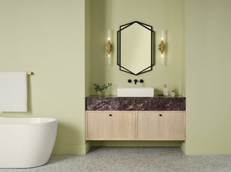
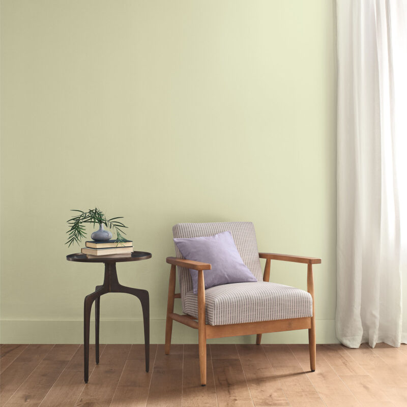
The color’s composition is specifically engineered to achieve this. Its subtle yellow base provides an inherent warmth, preventing the "clinical" or "cool" feeling often associated with pastels. In color psychology, this specific ratio of yellow to green is associated with vitality and organic growth, providing a sense of renewal without the visual intensity of brighter lime or neon greens. This makes Celery a versatile candidate for diverse architectural styles, from the clean lines of contemporary apartments to the ornate detailing of traditional, historic homes.
Expert Insight: Wellness as the Foundation of Design
Ashley Banbury, the color marketing manager at Sherwin-Williams, emphasizes that the selection process for 2027 was driven by a fundamental shift in homeowner priorities. “Celery was chosen because it reflects today’s essential needs: wellness, balance, and connection,” Banbury stated. “There is an undeniable movement among designers and consumers to create environments that actively support mental health. We are no longer designing just for aesthetic impact; we are designing for emotional regulation.”
This focus on wellness is supported by increasing interest in interior design as a form of preventive health. Market research from the past two years indicates that consumers are investing more in "sensory-friendly" home updates—utilizing lighting, texture, and color to reduce cortisol levels. By opting for a soft, muted green, Sherwin-Williams is positioning its product as a tool for environmental stability.
A Comprehensive Palette for Dimensional Layering
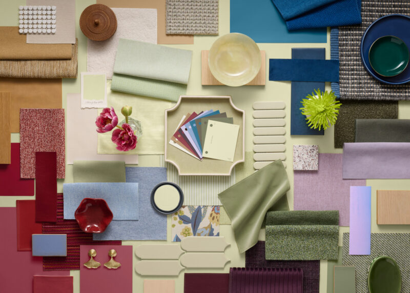
The 2027 Color of the Year does not exist in a vacuum. It is supported by a carefully curated palette designed to allow for depth and contrast within a room. The associated color stories are divided into functional categories:
- The Foundation: White Flour (SW 7102) and Woven Wicker (SW 9104) provide the necessary neutral base to ground the airiness of Celery.
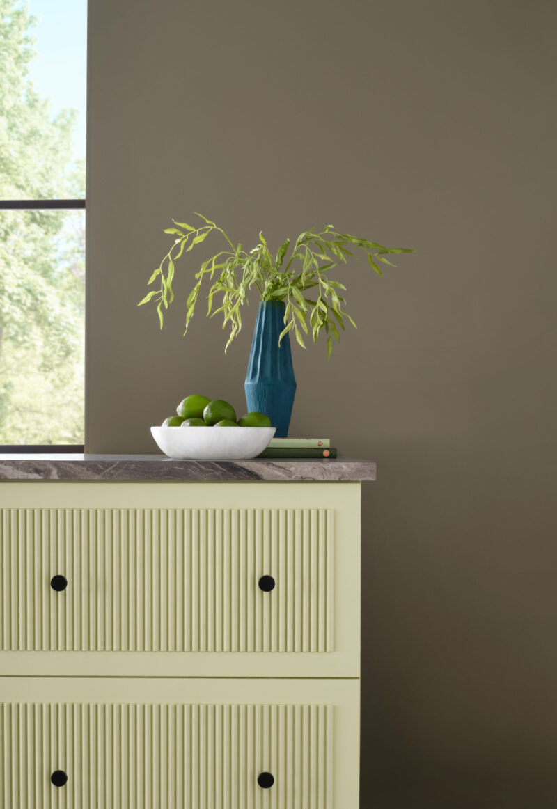
- The Depth: Artichoke (SW 6179), Cocoon (SW 6173), and Georgian Bay (SW 6509) are intended to add weight and sophistication, allowing for a tonal layering effect that prevents a room from feeling one-dimensional.
- The Expressive Accents: For those looking to add drama, the inclusion of Kirsch Red (SW 6313) and Plum Brown (SW 6272) provides a high-contrast, sophisticated pairing. These deeper, richer tones serve to ground the lighter Celery, offering a juxtaposition that feels intentional and curated.
- The Experimental: Potentially Purple (SW 6821) and Cosmos (SW 6528) offer a softer, more whimsical alternative for accents, demonstrating how far the palette can stretch while remaining cohesive.
Furthermore, the integration of Minwax’s 2027 Color of the Year, "Pickled Oak," into the broader forecast highlights a cross-industry trend toward honoring natural wood finishes. This integration suggests that the 2027 design language is one that favors raw materials over high-gloss, synthetic finishes.
Broader Economic and Market Implications
The selection of a "softer" color like Celery also has implications for the paint industry’s supply chain and marketing strategies. By choosing a color that is highly adaptable, manufacturers can drive sales across multiple demographics. Unlike bolder colors, which often see a shorter shelf-life in terms of consumer trends, a shade like Celery is designed for longevity. This aligns with a growing consumer sentiment toward sustainability; when homeowners choose a "timeless" yet fresh color, they are less likely to repaint within a short timeframe, aligning with the broader "buy better, keep longer" movement in home improvement.
Moreover, the availability of Celery through both the professional-grade Sherwin-Williams store network and the retail-focused HGTV Home by Sherwin-Williams line at Lowe’s ensures mass-market accessibility. This dual-channel distribution strategy allows the company to capture both the DIY home enthusiast and the professional interior designer, ensuring that the color becomes a ubiquitous feature in home portfolios for the coming year.
Implementation and Design Applications
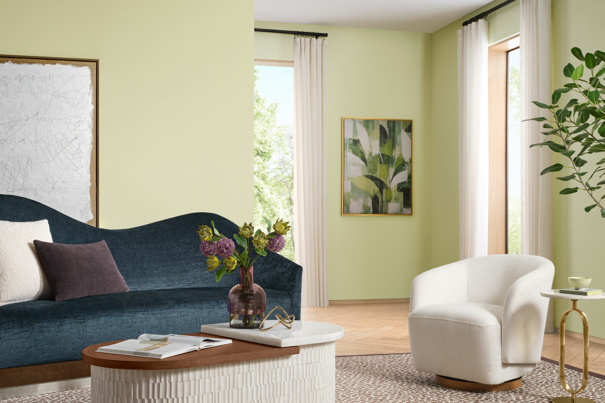
In practice, the versatility of Celery is one of its primary assets. Designers have noted that it functions effectively as a "new neutral." In kitchens, it offers a softer alternative to the ubiquitous navy or charcoal cabinets. In bedrooms, it provides a tranquil backdrop that pairs seamlessly with the warmer wood tones and organic textiles currently trending in luxury bedding and furniture.
The ability of the color to shift depending on the light source—appearing more yellow-toned in direct sunlight and more green-toned in shaded areas—makes it a dynamic choice for spaces that receive varying degrees of natural light throughout the day. This responsiveness is a key selling point for urban dwellers living in smaller, light-constrained environments, where the goal is to expand the perception of space.
Conclusion: The Quiet Revolution
The 2027 Color of the Year is not an attempt to shock or disrupt; it is a calculated effort to harmonize the home. As society continues to navigate a complex, high-velocity world, the role of the residence as a sanctuary has never been more critical. By opting for Celery, Sherwin-Williams is effectively betting on the idea that the future of interior design is not about making a loud statement, but about creating a persistent, quiet, and deeply restorative atmosphere. As the industry moves into 2027, the focus remains clear: home is not just where one lives, but how one heals.