
 Indra Kusuma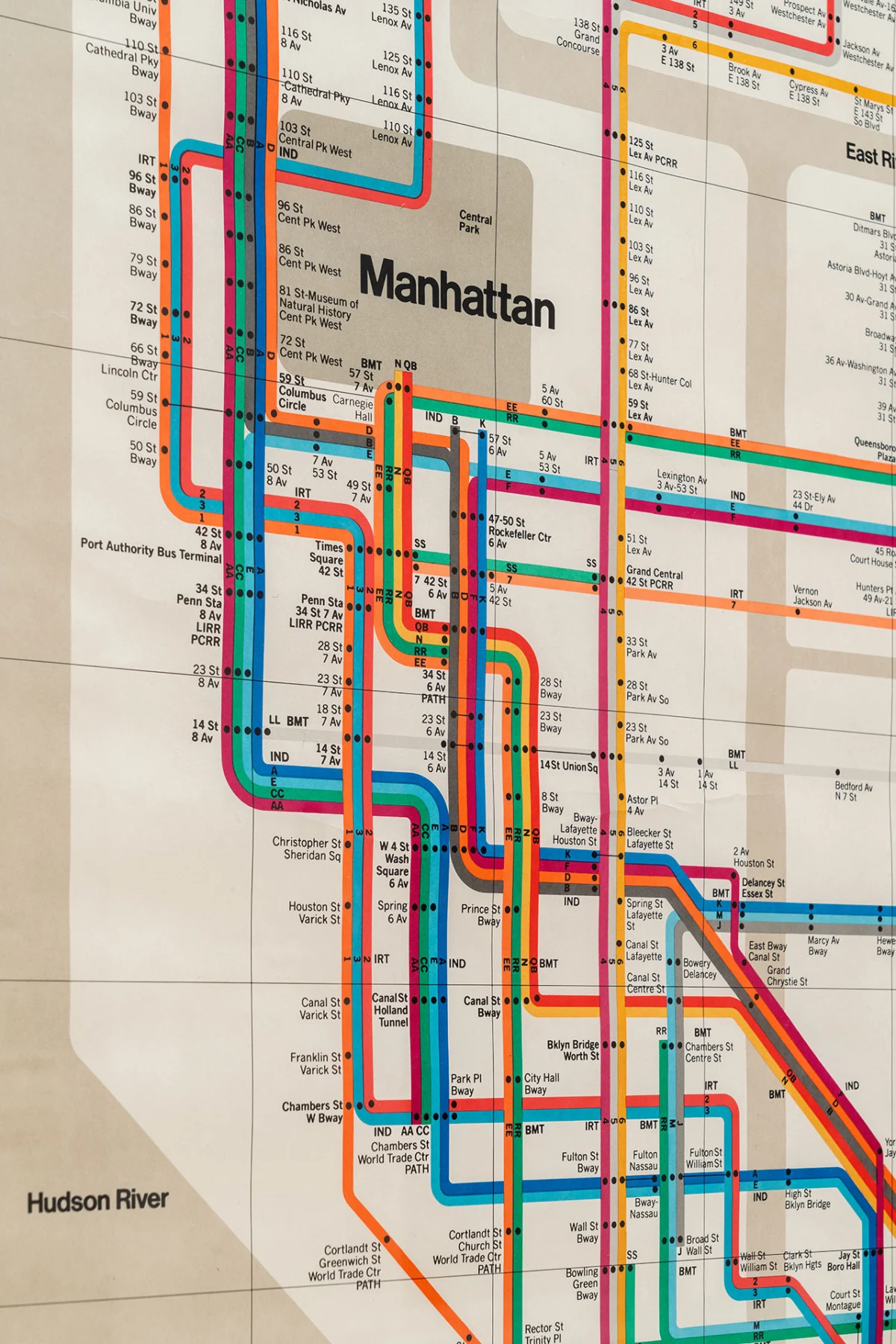
Triennale Milano is currently hosting "A Language of Clarity," a comprehensive retrospective dedicated to the monumental contributions of Italian design titans Massimo (1931–2014) and Lella Vignelli (1934–2016). This landmark exhibition, co-curated by Francesca Picchi, Marco Sammicheli, Martin Kerschbaumer, and Thomas Kronbichler (Studio Mut), celebrates the couple’s profound impact on modernism, visual culture, and multidisciplinary design, emphasizing their enduring philosophy that design was intrinsically linked to life itself. As New York-based designer Michael Bierut, who spent a formative decade under Massimo’s tutelage in the 1980s, once remarked, "For Massimo, design was life and life was design." The exhibition, which runs until September 6, 2026, serves as a meticulously crafted environment reflecting the Vignelli mindset, showcasing their prolific output across graphic design, product design, interiors, and architectural photography, drawing heavily from the extensive archives of the Vignelli Center for Design Studies at the Rochester Institute of Technology (USA).
The Genesis of a Design Philosophy: Swiss Principles and Italian Flair
The Vignellis’ work is characterized by a relentless pursuit of clarity, functionality, and timelessness, heavily influenced by the principles of Swiss-centric graphic design. This approach, which Michael Bierut absorbed under Massimo’s watchful eye, championed grid systems, universal sans-serif typography, and a minimalist aesthetic aimed at enhancing legibility and comprehension. Bierut vividly recalls a New York City permeated by Vignelli’s influence during his early career: "In those days, it seemed to me that the whole city of New York was a permanent Vignelli exhibition. To get to the office, I rode the subway with Vignelli-designed signage, passed people carrying Vignelli-designed Bloomingdale’s shopping bags, and walked by St. Peter’s Church, with its Vignelli-designed pipe organ visible through the window." This omnipresence underscored the pervasive impact of their systematic design thinking on public and commercial spheres.

Marco Sammicheli, Director of the Museo del Design Italiano at Triennale Milano, articulates the core of their philosophy: "Clarity, for the Vignellis, is not an aesthetic preference; it is an ethical and methodological position. Their work is always rooted in a logical process, grounded in essentiality and reduction." This ethical stance drove their commitment to creating designs that were not merely aesthetically pleasing but profoundly functional, accessible, and enduring. Their rigorous methodology transformed complex information into easily digestible forms, a hallmark seen in projects ranging from corporate identity systems to public transit maps.
A Partnership Forged in Italy: Early Lives and Collaborative Beginnings

The collaborative journey of Massimo and Lella Vignelli began in their native Italy. Massimo was born in Milan, a city renowned for its design heritage, while Lella, born Elena Valle, hailed from Udine. Their paths first crossed at an architecture conference in 1949, a serendipitous encounter that foreshadowed their intertwined destinies. They reconnected and began to cultivate both a personal and professional partnership while studying at the Istituto Universitario di Architettura di Venezia (IUAV), a prestigious institution that shaped their architectural sensibilities. They married in 1957, marking the official commencement of their lifelong creative alliance.
Shortly after their marriage, the couple embarked on an initial sojourn to the United States, with Lella pursuing advanced architectural studies at the Massachusetts Institute of Technology (MIT). This exposure to American academic and professional environments provided them with a broader perspective, which they would later integrate into their practice. However, it was their return to Milan at the height of Italy’s postwar design renaissance that truly ignited their collaborative studio. This period, characterized by an explosion of creativity and industrial innovation, saw Italian designers pushing the boundaries of form and function. Operating from Milan, the Vignellis rapidly established a multidisciplinary practice, seamlessly traversing graphics, product design, exhibitions, and interiors. Their early Italian clientele included an impressive roster of iconic brands such as Olivetti, known for its innovative typewriters; Pirelli, the tire giant; Venini, a renowned glass manufacturer; La Rinascente, a leading department store; Poltrona Frau, a luxury furniture maker; and the burgeoning Xerox Corporation, for whom they undertook significant design projects. This early work laid the foundation for their systematic approach, demonstrating their ability to apply a consistent design language across diverse mediums and industries.

The American Chapter: Unimark International and Iconic Identities
The Vignellis’ influence expanded globally when Massimo was invited to co-found and serve as design director of Unimark International in 1965. This pivotal move saw Massimo and Lella relocate to New York, marking a significant new chapter in their careers. Unimark International was a groundbreaking design consultancy dedicated to establishing universal corporate identity systems for large multinational corporations. It was a revolutionary concept for its time, aiming to bring order and clarity to the fragmented visual landscapes of global businesses. Under Massimo’s leadership, Unimark became instrumental in defining the visual identities for major American clients, including the Ford Motor Company, Knoll (with whom they would develop a decades-long relationship), Alcoa, Bloomingdale’s, and the iconic American Airlines.

In 1971, seeking a more focused and personal approach to design, the Vignellis departed from Unimark to establish their own firm, Vignelli Associates. This marked a transition from a large corporate structure to a more agile studio model, allowing them greater creative control and the ability to delve deeper into a wider range of projects. Marco Sammicheli observes, "The move to New York is presented as a moment of expansion. It coincides with their rapid international recognition and with the testing of their language within a new economic and cultural system." Indeed, New York provided the perfect crucible for their systematic design philosophy to thrive, demonstrating its adaptability and effectiveness across various cultural and commercial contexts.
Their output during this period showcased a deeply systematic approach to design. Typographic programs were meticulously crafted for consistency and legibility, signage systems provided intuitive navigation, and publications and posters communicated with unparalleled clarity. Among their most celebrated and impactful works from this era is the New York City Subway map. Introduced in 1972, this map, while initially controversial for its abstract, diagrammatic representation over geographical accuracy, revolutionized urban transit navigation. It prioritized clarity of routes and transfer points, becoming a benchmark for public information design globally, despite being replaced later by a more geographically accurate version. Its influence, however, remains undeniable, a testament to the power of schematic design to simplify complex realities. Similarly, their corporate identity for Bloomingdale’s, featuring distinctive Helvetica typography, transformed the shopping bag into a recognizable design icon, subtly reinforcing the brand’s sophisticated image.

Lella Vignelli’s Essential Contributions: Rectifying the Narrative
A central ambition of "A Language of Clarity" is to shine a much-deserved spotlight on Lella Vignelli, whose profound contributions have, for too long, remained unjustly in the background of design history. Francesca Picchi emphasizes this point: "One of the central ambitions of the exhibition is to restore visibility to Lella Vignelli, whose contribution has too often remained unjustly in the background. Lella was an architect of remarkable rigor and sensitivity." Her architectural training from IUAV and MIT instilled in her a structural precision and an acute understanding of space, form, and material that permeated all their joint endeavors.

Lella’s independent and collaborative work spanned a diverse array of design disciplines. Her expertise ranged from crafting elegant interiors, such as the Artemide showroom, to designing functional and beautiful furniture for companies like Poltrona Frau. A particularly notable piece is the Handkerchief Chair for Knoll, a design that embodies her characteristic elegance and exactitude. This chair, with its flowing, sculptural form and innovative use of materials, is a testament to her mastery of industrial design and her ability to infuse functionality with artistic grace. Beyond specific projects, Lella was also the strategic and business mind behind Vignelli Associates, managing operations and client relations, which allowed Massimo to focus on the creative direction. Her rigorous approach to project management and her keen eye for detail were indispensable to the studio’s success and the consistent quality of their output. The exhibition meticulously highlights these often-overlooked aspects of her career, presenting a more complete and accurate picture of the Vignellis’ truly collaborative partnership.
The Exhibition Experience: A Coherent System

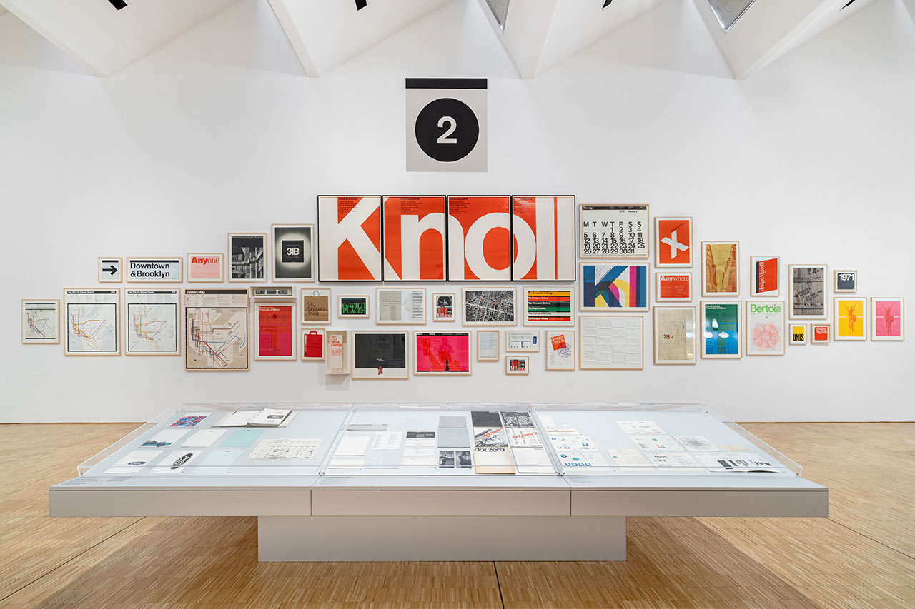
The exhibition itself at Triennale Milano is a masterclass in curation, designed by Jasper Morrison’s Office for Design with David Saik. It functions as a coherent system, mirroring the very principles of order and clarity that defined the Vignellis’ work. Displays of printed ephemera, including books, magazines, posters, and corporate identity manuals, are meticulously arranged in cases, framed, and hung with graphic precision. This careful presentation provides an all-encompassing overview of their commercial print work, allowing visitors to appreciate the consistency and depth of their graphic language.
Beyond graphics, the exhibition showcases the breadth of their multidisciplinary practice. Examples of their product design, such as the iconic Max dinnerware, are prominently featured. The story behind the Max dinnerware, originally conceived for an Italian manufacturer of plastic figurines and toys, illustrates the Vignellis’ perseverance and belief in good design. They persuaded the company to produce their elegant, modular, stackable, and affordable tableware, which, despite initial distribution challenges, was later revived through American entrepreneur Alan Heller. It ultimately achieved classic status, receiving Italy’s highest design honor, the Compasso d’Oro, in 1964. The exhibition also includes furniture pieces, architectural photography, and even sketches and prototypes, offering a holistic view of their creative process.

The collaboration with the Vignelli Center for Design Studies at the Rochester Institute of Technology (RIT) has been crucial to the exhibition’s depth and authenticity. The Center houses an unparalleled archive of over 750,000 documents, objects, and artifacts, spanning every facet of the Vignellis’ extensive career. This vast collection, encompassing book design, visual identity, corporate systems, exhibitions, products, and furniture, provides an invaluable resource for understanding their systematic approach and the evolution of their "language of clarity." The sheer volume of this archive underscores the prolific nature of their work and their unwavering commitment to documenting their design process.
The Enduring Legacy: A Universal Design Language

Looking back, it is timely and imperative to reassess the Vignellis’ indelible place in design history. While their work, particularly between the mid-1960s and 1980s, may have at times been underrecognized within the broader narrative of Italian design, today they are universally understood as more than just champions of Italian modernism. They are celebrated as architects of a universal design language—a lexicon defined by discipline, rigor, and a remarkable consistency that continues to resonate across generations and cultures.
Their impact transcends mere aesthetics; it speaks to a fundamental belief in design as a tool for organization, communication, and human betterment. The principles they championed—clarity, systematic thinking, timelessness, and functionality—remain cornerstones of effective design practice worldwide. From the intuitive flow of a transit map to the cohesive identity of a global corporation, the Vignellis demonstrated how thoughtful design could simplify complexity and enhance daily life. The "A Language of Clarity" exhibition not only commemorates their individual and collective genius but also reaffirms their status as visionary designers whose modernist ideals continue to shape our visual world. By emphasizing Lella’s often-eclipsed contributions, the exhibition also serves as a vital corrective, ensuring that the full scope of their collaborative brilliance is recognized and celebrated.

The exhibition remains on view at Triennale Milano until September 6, 2026. To learn more or find tickets, visit tktktk.
Photography by Delfino Sisto Legnani of DSL studio © Triennale Milano